Elegant simplicity drives Mailbird 3.0 redesign
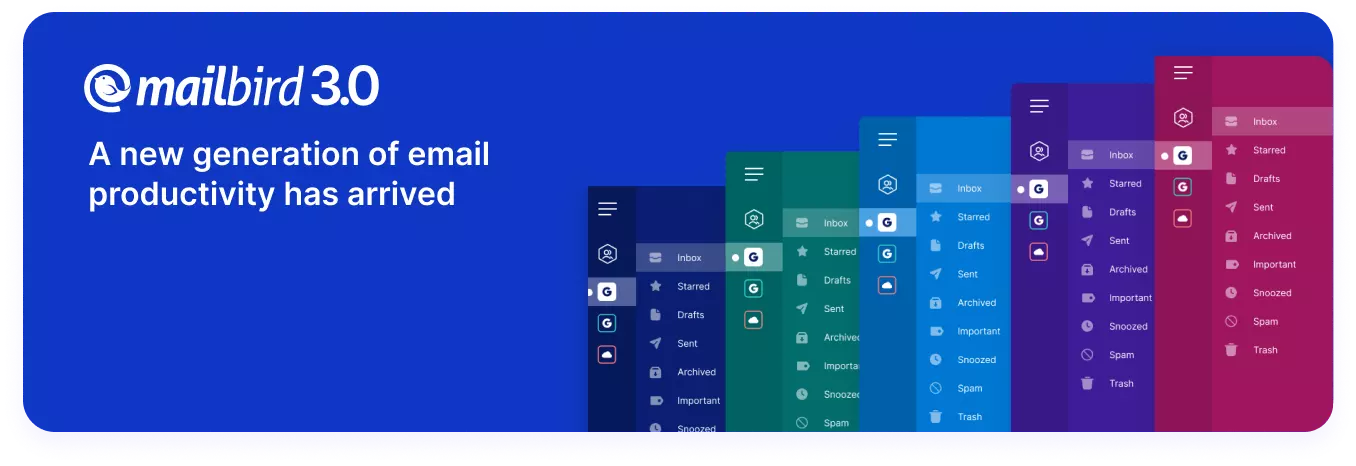
Dive into Mailbird 3.0 and Experience an intuitive interface that marries elegance with simplicity, elevating your email management to the next level.
"Perfection is achieved, not when there is nothing more to add, but when there is nothing left to take away."
- Antoine de Saint-Exupery
There are few universally recognized pairings so perfectly matched that the mere mention of one automatically evokes thoughts of the other: Batman and Robin, apple and cinnamon, form and function.
I had the pleasure of discussing the importance of the last duo with Jalita De Waal, Head of Design at Mailbird.
Tasked with updating the design of Mailbird's eponymous email client, Jalita shared her philosophy, inspiration, and process for the company's much-anticipated version 3.0's exciting new look.
Goal of the Mailbird 3.0 redesign
In software development, design shouldn't exist simply to serve itself. It must drive and support a purpose. Ostentatious eye candy without substance to anchor the design into a usable tool serves little purpose except to give users something new and shiny to look at—but that can get old fast.
“My primary objective with the Mailbird 3.0 redesign was to create an experience that felt familiar, effortless, personal, and harmonious,” said Jalita. “It was about preserving the essence of Mailbird, enhancing its best features, and preventing it from morphing into something it's not.”
But many people are creatures of habit; change can be intimidating. We become accustomed to seeing and doing things a certain way. When someone or something drastically alters this familiarity—especially with an everyday tool like email—it can be disorienting. And not everyone is open or willing to adjust to a new norm. With this in mind, Jalita sought to bridge the gap between old and new.
“I wanted to design an experience that builds trust,” explained Jalita. “Many of our most loyal users have been with us for years, and that loyalty means the world to us.”
This was the challenge she had to contend with: designing something new to avoid obsolescence while presenting a familiarity that won't disrupt users' daily routines.
“It's essential for us to keep improving,” Jalita added. “We need to offer the best email experience to our trusted users. But we also must understand the delicate balance between feeling secure in something learned through repeated behavior and embracing new possibilities as the digital landscape evolves.”
For Jalita and her design team, this wasn't “new” for the sake of “new”. Every Mailbird 3.0 design element has a functional purpose. In addition to updating its base design, another important goal was to enhance the app's level of personalization and customizability.
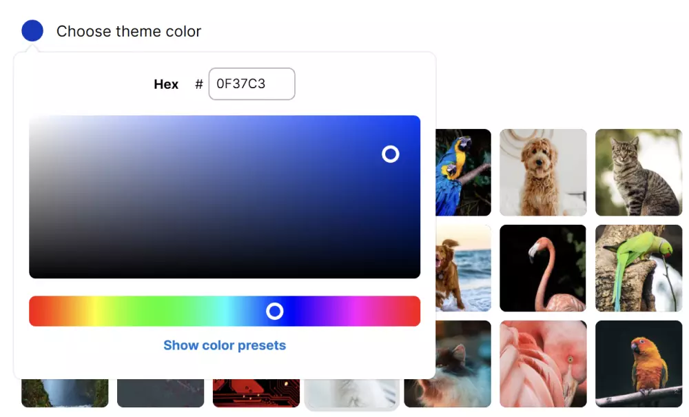
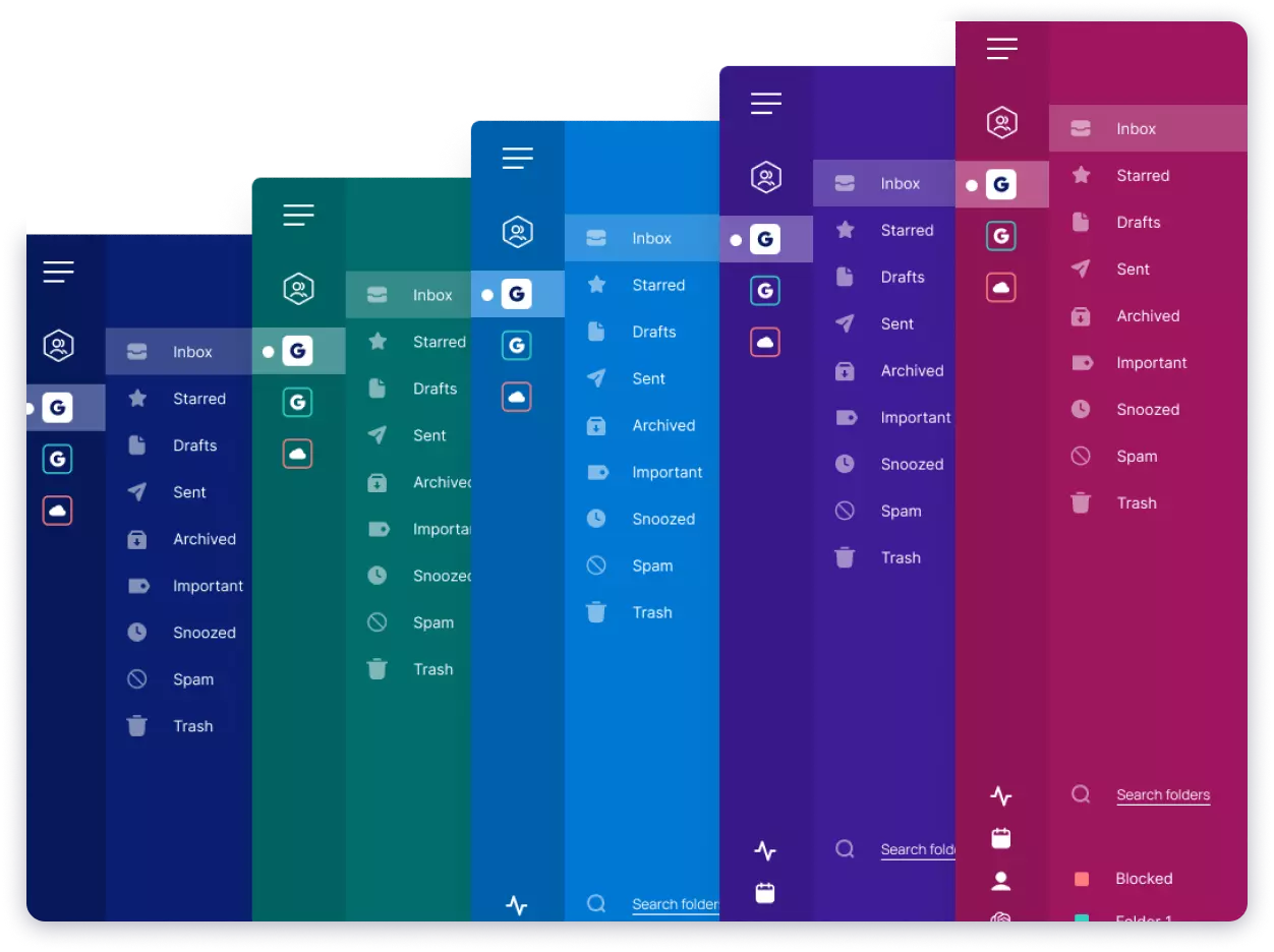
The new color picker, for example, is one of the most significant design additions. Personal users can use it to customize their email workspace to suit individual tastes. And businesses can use it to brand Mailbird to match their company colors.
In this respect, Mailbird is defining the future of its email app by embracing the past and enhancing all the things that make it a success.
A blueprint for design
“Crafting something new is quite the journey,” said Jalita. “I was fortunate to have free rein throughout the design process.”
This could be both a blessing and a curse. A blessing because you're limited only by what your imagination can conjure up and what your hands can carry out. But a curse because it's easy to be stymied by infinite possibilities and decision paralysis.
Jalita, however, was quick to embrace the former and unintimidated by the latter, turning any potential uncertainties into clearly defined tasks.
“I prefer to start with a 'sky's-the-limit' mindset, free of any boundaries,” she explained. “That's where those game-changing visions are born. Without dreaming big from the very beginning, we can't achieve our desired 'wow' factor.”
But she understood from the very outset that the power of this design freedom must be wielded responsibly. Despite infinite possibilities and the temptation to allow her imagination to run wild, she knew she couldn't discard the things that Mailbird users love most about the app simply for the sake of newness.
So, with this blank slate, where did she begin?
First, there needed to be focus and direction—a game plan and strategic restraint to produce a design that would be accepted by both new and long-time users.
“Many brands are embracing a digital-first mindset,” said Jalita. “They're adopting a simplified design language that's also adaptable to various needs, much like the recent transformation of the Warner Bros brand.”
Second, redesigns don't always have to be complete overhauls. Drastic design changes can alienate long-time users. Sometimes an accumulation of small and subtle user interface changes can be far more productive than one dramatic visual leap.
“When it comes to design decisions, I walk a tightrope between following trends and staying grounded,” said Jalita. “In today's design landscape, we're witnessing a shift towards smoother angles, cleaner layouts, heightened emphasis on typography, and a strong focus on cross-platform functionality and style.”
Finally, Jalita highlighted the importance of integrating data in her redesign decisions.
“It doesn't always require flashy dashboards or marketing-driven experiences," explained Jalita. “Instead, it's about understanding which elements our customers use daily, aiding decision-making and prioritization. Design is an ever-evolving field with continuous room for improvement. Effective use of data helps us focus on what truly matters to our users.”
Collaboration brings a vision to life
To whittle down all her design possibilities and narrow her focus into viable options, Jalita took a collaborative approach to review what already works well, what's dated or obsolete, and what needs to be improved.
“It all begins with a careful analysis of what we already have as our design foundation,” said Jalita. “I love casual and free-flowing chats with colleagues and customers, where you uncover little gems that formal surveys often miss. Those are pure gold.”
After her initial fact-finding discussions, she embarked on an exploration not only of the software world, but across various design realms and even different industries. And then the internal brainstorming began—a process that tends to get a bit wild, Jalita acknowledges.
Working closely with Michael Olsen, Mailbird's CEO, CTO, and co-founder; and Dimas Mohammad, the lead front-end developer, they crafted a strategic plan to realize their ambitious blueprint.
“It's important that everyone feels confident in the plan before we dive into the project,” said Jalita. “We laser-focused on the areas to prioritize and immediately addressed rough edges that needed to be smoothed out.”
Happy to be working with a team that's been part of the Mailbird journey for so long, Jalita found her colleagues' ideas invaluable. They possess an intimate understanding of Mailbird users' and their needs, built upon years of experience.
“We started with a grand vision and then, side by side, we chiseled it into shape, iterating in design and development—the way it should be. It's truly a collaborative journey that brought our vision to life.”
Elegant efficiency: A marriage of form and function
Contemplating how many apps tend to blend together and lack distinctiveness, Jalita sought to prevent Mailbird from falling prey to the same fate.
“What sets Mailbird apart is both its design and its customizability—both in form and in function,” said Jalita. “We aim to make it an app that becomes what you want it to be, something that grows with you and adapts to your needs and tastes.”
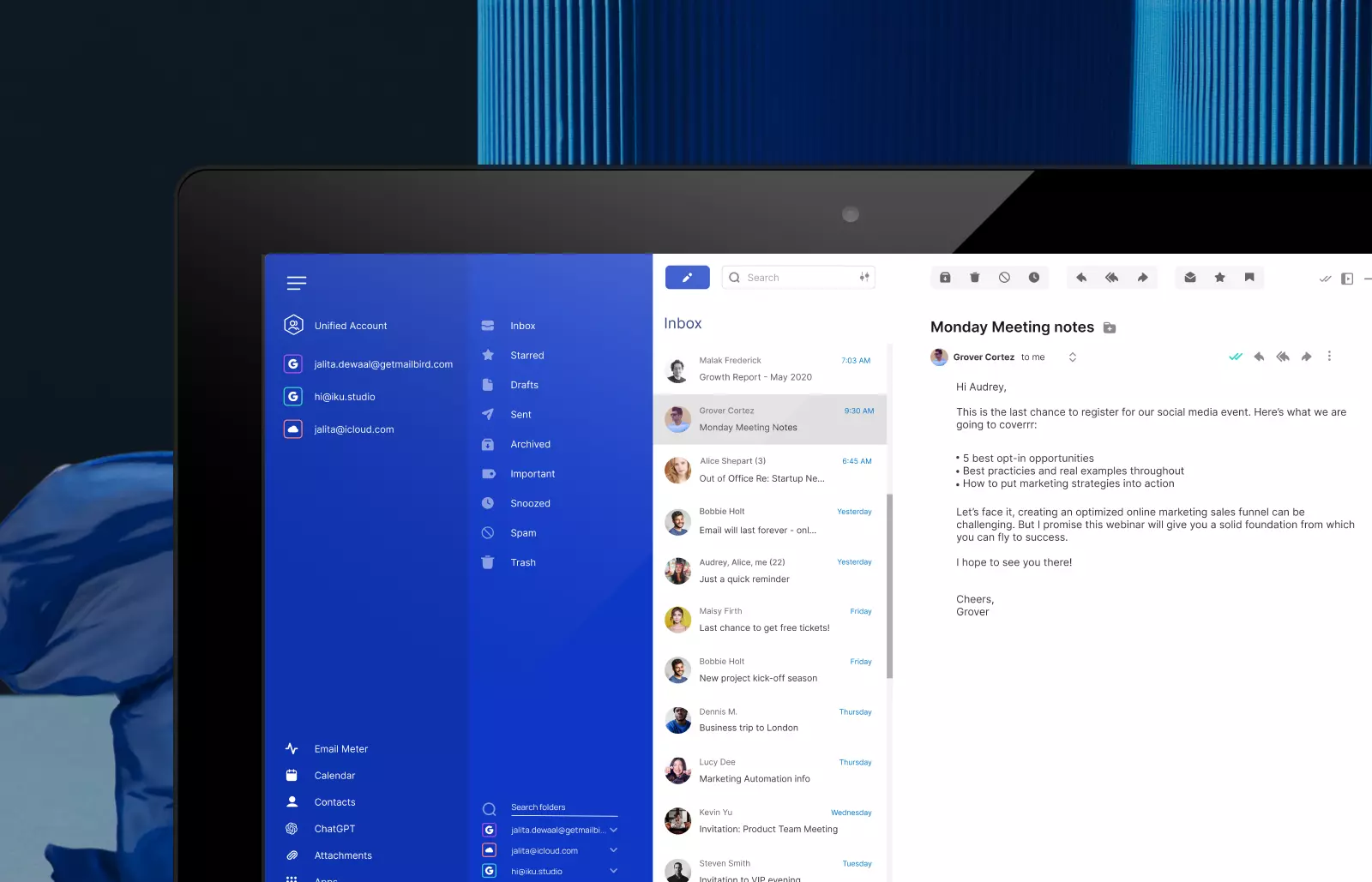
Mailbird 3.0’s redesign includes:
- Optimized screen space
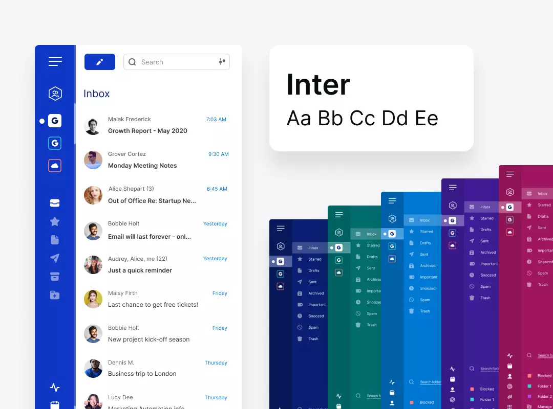
The new screen layout has been tailored to adapt seamlessly to the latest screen sizes, providing users with an immersive experience. - Font evolution
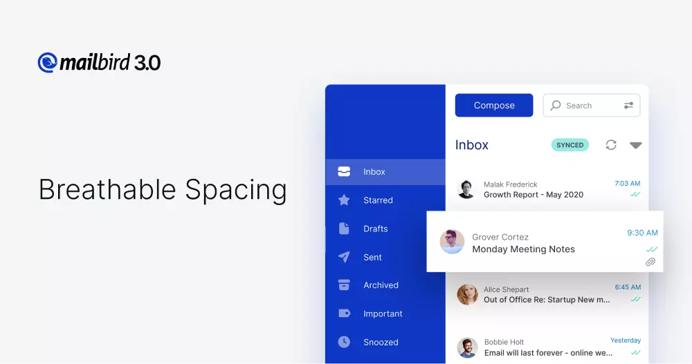
Mailbird 3.0 embraces the stylish Inter font, created by Swedish Figma designer Rasmus Andersson. It was crafted to enhance readability, especially on computer screens. - Breathable spacing
The design team meticulously reimagined spacing across the entire app, creating an airy and spacious environment that enhances focus. - Icon transformation
Mailbird's icons have been completely transformed to ensure they blend seamlessly and form a clear, stunning, and modern iconography. - Calming color palette
Version 3.0 offers 20 new and soothing theme colors. From deep sapphire to sea green to platinum, each hue was meticulously chosen to bring sophistication and freshness to users' email experience. - Softer font colors
System font colors have been updated to help reduce eye strain. - Expressive customization
Background thumbnail size has been increased, making it simpler to find the perfect mood-setting backdrop. - Vibrant folder personalization
Mailbird's 48 new folder and label colors make it easier to organize and identify messages. - Nested folders refined
Nested folders have been redesigned to simplify organization, ensuring users can always find what they're looking for. - Enriched email cards
Conversation list and email card elements have been optimized to produce a seamless email experience—from unread messages to revamped icons. - Sender styling
From avatars to color schemes, Mailbird's email visuals have been redesigned to ensure messages and senders are always easily identifiable. - Attachment elegance
Revamped attachment icons and color schemes make files easily identifiable. - Effortless scrolling
An improved scrollbar design provides a sleek and seamlessly intuitive experience. - Fresh windows and notifications
Mailbird's menu window and notifications have been revamped to provide extra emphasis on important updates. - Enhanced settings menu
A modern update to Mailbird's settings menu presents a more spacious design, simplifying email preferences. - Streamlined navigation
New adaptable navigation optimizes both horizontal and vertical views, regardless of screen or window size. - Revamped horizontal view
With improved UX and repositioning of some icons, the horizontal view now offers an even more comprehensive snapshot of email messages. - Fresh onboarding
The onboarding experience has been revitalized, featuring a new set of engaging illustrations to guide users through the setup process.
An exciting future for Mailbird
The Mailbird 3.0 redesign is very much a journey, not a destination. It's a single yet substantial step among the millions that preceded it and the millions that will follow.
There are countless intriguing facets to a redesign, ones that might not be immediately apparent to casual observers. Seemingly simple elements may have gone through dozens of iterations and involved hours of discussion.
For Mailbird users, all these “little things” are fluid and transparent. Jalita and the design team made sure of that. The more they think about every individual element, the less users have to—and they wouldn't have it any other way.